


 Overview
 What's new
 How to Use
 Step by step
 Video tutorials
 Technical Questions
 License Questions
 Recent Questions
 Demos
Demos Bulgy
Bulgy Magnetic
 Fair (RTL mode)
 Push Tall (responsive)
 More demos
 Download
 Contact
CSS3 Drop-Shadow for Dropdown menus
 FREE download
 More demos
CSS3 drop-shadow example for submenus
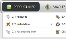
CSS3 Drop Shadow
The drop-shadow parameter in CSS3 is a step beyond regular box shadow feature, which allows producing truly outstanding graphics for websites. There are countless possible uses for CSS3 drop shadow feature, starting with sub-menus of navigation bars that drop a shadow on the website’s ‘surface’ when rolled out and up to advanced and really stylish things like page curls.
Before the introduction of CSS3, these effects had to be achieved by separately creating an image with software like Photoshop, storing it on the server and applying as a regular CSS background. While it was effective in reaching the goal of displaying shadows beneath rectangular and other kinds of shapes on websites, it was not very efficient at it.
The image produced with Photoshop may have looked well at first, but when some changes had to be made to the website and image had to be resized, rearranged or its shape modified, there was no easy way of doing so. Web designers had to go back to Photoshop and recreate the shadow effect for another size or shape almost from scratch.
With the rise of CSS3, however, everything has become much easier. CSS3 shadow can be applied with a few lines of code and every aspect of it can be manipulated, achieving the exact result that a web builder is aiming for.
Color, direction, strength, transparency, size, area, all of these variables can be modified before and web page is published online. When compared to the dark days of creating shadow effects for web through Photoshop images, effects produced by CSS3 drop shadow parameter come as a true blessing.
There are several reasons for wanting to create shadow effects within a website. Everything that browsers render on the screen is inherently two-dimensional. Except for online browser-based games built in plugins like Java and Adobe Flash, there are few successful examples of sites on the Internet being designed in a full three-dimensional format. Most attempts at building 3D interfaces for websites have failed to attract visitor attention that would be worth the effort of doing so.
On the other hand, Internet users are fond of looking at websites where the presence of a 3D world is hinted at, ever so slightly. Shadows are one of those things that create an illusion of three-dimensional images and keep site visitors engaged, without disrupting the flow of the flat 2D content. When used correctly, letters and boxes that ‘drop shadows’ seem to pop out from the screen, convey a good sense of style and look very professional.
The wide range of additional variables and extra parameters allow CSS3 shadows to achieve the exact goals that web designers would want to be achieved, almost at the level of freedom that Photoshop provides. People may not be able to create a three-dimensional likeness of the Statue of Liberty that drops shadows into three different directions with varying levels of intensity (barely), but as far as those cool-looking page curls and levitating sub-menus go, CSS3 shadow parameter will do the trick.
Recent Templates
FAQ
- December 09, 2013 Css3 mega drop down menu doesn'r run
Hello I bought css3menu, the program not working. Can not run it. Can you help me? my os - windows 8
- October 20, 2013 Linux and css3 drop down menu
I like your product. I use Linux, can I use the Mac OS 10.6+ download ?
- October 02, 2013 Css3 mega drop down menu submenus do not drop down in IE
Greetings support team, I’m contacting you because I have downloaded CSS3 Menu and I think it is fantastic! It looks great in all basic browsers but not in IE. I mean the submenus do not drop down. Does it should work with IE?
- September 23, 2013 Css3 drop down menu and Dynamic Web Template in Dreamweaver
I have a bit of a problem: I am trying to use the menu in a (Dreamweaver) template and therefore have to put the CSS3Menu index files in the template folder - but when I create a webpage from that template in the root folder i...
- July 31, 2012 Create a space between the main drop down css3 menu generator menu bar and the drop down buttons
I just started using the Css3menu program and am enjoying it's ease of use and simplicity of code. I was wondering how I would manipulate the code as to create a space between the main menu bar and the drop down buttons.
- July 24, 2012 Transparency around css3 drop down menu generator
I'm trying the free menu and would like to have transparency around the menu. Any way to do that?
- June 07, 2012 Gradient of free drop down css3 menu is absent in IE
I just purchased the menu and installed it on my page. It looks great in all browsers. But there is some problem with IE browser. The corners don't look rounded and there is no gradient in submenu anymore.
- June 04, 2012 Changes in css3 drop down menu free
I lost my project file and I need to make small changes with my menu. I want to add a few items. Can I do it or I must create new menu?
- May 31, 2012 "Invalid key" in vertical drop down css3 menu
I have bought CSS3Menu recently, but have problems with registration. I can't get the registration key to work. It keeps telling me it is invalid. What can I do?
- May 30, 2012 Multicolumn template in css3 vertical drop down menu
I've just purchased CSS3 menu 2.3 because I wanted to use the multicolumn template. I've been through all the templates, including the blocks templates and cannot find a multicolumn one anywhere.
- March 27, 2012 Transparent background for horizontal drop down css3 menu
I was wondering if you could advise if the menu is able to have a transparent 'background' colour? If so, how would you achieve this?
- March 12, 2012 How to add css3 horizontal drop down menu to my own page?
I use the trial version and I can't make it shows on the website; I used the html file as the file name after the clicked the "Publish" button. Is there anything I need to do before it shows on the website?